Friday, September 10, 2010

High Voltage

Long time no post... Sorry about that! There has been a lot going on recently: I finished my bachelor thesis, moved to another city, and most importantly: I've started working. The privilege of a student's life that I am retrospectively starting to appreciate the most is definitely the freedom in time allocation. You don't forcibly have less to do as a student (well during exam/thesis writing time, that is; otherwise you do have less to do), but you're completely free to chose when you do it. And as I used to do most of my design stuff late at night - a time where now I am sleeping as every brave and hard-working citizen - my fontstructing activity curve has suffered a sharp bend downwards.

So no wonder that my last font was a very quick job. If I recall correctly, the main character set was done within about an hour - considering the warm reception it got from the ever-amazing fontstruct community, I'm very happy about the input/output ratio! It has also been featured and reviewed on the PCWorld.com download section.

But enough of the babbling: Here it is!


As you can see, it's quite a crossbreed between blackletter, script and vintage that has spent too much of it's time hanging around heavy metal bars in the seventies and eighties. It shows some ambition to make it to an old Ford Mustang's trunk deck, but only if a real rockstar is driving two highly drugged groupies around with it while throwing whiskey bottles and parts of his smashed guitar at pedestrians.


Due to its strictly geometric nature, it also lends itself to graphic baublery that in this case somehow reminds me of the masterfully crafted ambigrams in Dan Brown's superlative-oozing "The Da Vinci Code":


You can download this font here (Registration required), and use it for free in any non-commercial project. For commercial licensing, please contact me.
This is work in progress: I plan to add more alternates and swirls to the set as soon as I find the time. Checking back for updates somewhere in the future might worth it.


Saturday, May 29, 2010

Frostletter

This is my first attempt at something blackletterish. It was a relatively difficult delivery, and the character set isn't nearly as complete as I usually like to do it, but I published it anyway to get some feedback on whether it would be worth the struggle to complete it. A true blackletter font would surely need some more profound knowledge about calligraphy and its history than I have the patience (and currently time) to acquire, so understand this more as an attempt to create a blackletter look with still relatively modern, familiar and readable character shapes.
I started with the lowercase characters as they are obviously much easier to design than the uppercase; the latter were the much trickier part because of their usually very decorative and complex nature in blackletter fonts, which made the compromise between a modern and readable look and the blackletter "core" much harder to achieve.


In the end it turned out to have sort of a fantasy look, like the font an evil king sitting on a throne of ice ruling over a barren, desolate kingdom in the everlasting winter of the isolated mountains of the far north of Middle Earth (or Azeroth, for you WoW addicts out there who have no time to read J.R.R. Tolkien) would use to write his feared verdicts on polar bear skin and nail it to every dead tree trunk in his stormridden land that never sees the sun... Or something like it.

You can download this font here (Registration required), and use it for free in any non-commercial project. For commercial licensing, please contact me.


Saturday, May 15, 2010

Punchline

Funny... Second post, second time the font's name starts with Punch. Don't worry, I'm fine and generally a very pacific human being.
Anyway, this is my latest font, done as always with FontStruct, the amazingly easy to use online font creation software that you should really try out if you're into typography and/or lego bricks. (And no, they don't pay me for this enthusiasm... It's real!)

Punchline is a ultra heavy slab serif face for flyers, stylish posters, powerful headlines and pickup truck advertisements. Not recommended for wedding cards or similar. But why don't you just look for yourself:


The font contains a full set of diacritics for most western european languages, and also includes €, $, £, ¥ and whatever else your might need.


Download it here. (Registration required.)
As always with my fonts, this is free for personal use only. If you want to purchase a licence for commercial use, please contact me.


Thursday, May 6, 2010

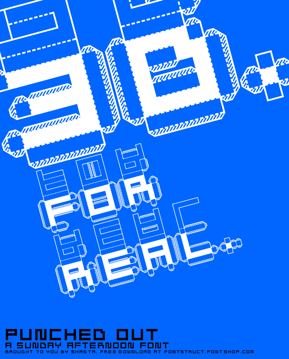
Punched Out

This is probably my most popular font: it has been downloaded about 45'000 times from dafont.com only! People seem to like punch out sheets...
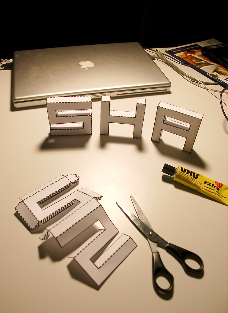
I think it's pretty self-explaining. Cut along the solid lines, fold along the dotted lines and put some glue on the shaded parts, put it all together, and there you go with your new toys!
Punched Out Sample
Here's what it looks like when brought to life with scissors and glue:
(And yes, I know I should have cleaned my macbook before taking this picture...)
Punched Out Sample
You can download the font for free from here (registration required) or here! This is free for personal use only. If you want to use it commercially, let me know!


Real Time Web Analytics